Introduction
Multilayer CSS organization methodology is a guideline to structure your CSS.
Core methodology principles are based on BEM and OOCSS ideas. MCSS was invented in Odnoklassniki.ru (Top 10 world social network) developers team and is recommended for other developers as core for own documentation and team based methodologies.
Despite the fact that this methodology originated in a large project with more than 60 developers and many inner services it can easily be used for small and medium sized projects as well. Its scalability gives developers an opportunity to chose the level of strictness of selected rules.
Documentation is still being constantly improved, along with secondary tools, such as front-end documentation engine Source. Originally documentation was written in russian and not all information is translated yet, but in upcoming updates all contents will be translated and main project language will be changed to english.
Please don’t hesitate to leave your questions in Issues section on Github or leaving comments below.
Fast navigation
- Main principles
- Style storing rules
- Module interaction scheme
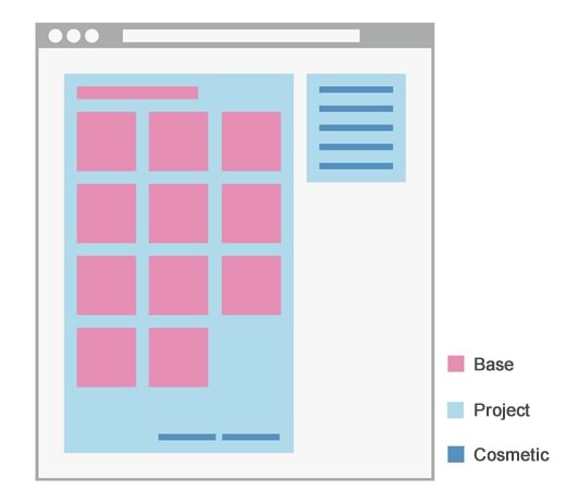
- 1 layer — base
- 2 layer — project
- 3 layer — cosmetic
- Context
- Real life examples
- Abbreviation dictionary
- Recommendations
Main principles
MCSS methodology is very scalable and does not force using specific code style, file system organization or specialized tools to work with it. The main thing is about separating rules for different blocks.
CSS modules (and blocks in them) are separated in to layers, where each layer has its own rules for exploitation and interaction with other layer modules.
Style storing rules
All styles of specific modules must be placed in separate section or CSS file:
/* Module name
-------------------------------------------------- */
.module { }

.module_list { }
  .module_list.__modifier { }
/* /Module name */
Modified selector with cascade, also are stored near other parent selectors:
/* Module name
-------------------------------------------------- */
.module { }

.module_list { }
    .module_list .other-module { }
/* /Module name */
The only exception is the context layer:
/* Module name
-------------------------------------------------- */
.module { }

.module_list { }
    .touch .module_list { }
    .ie9 .module_list { }
/* /Module name */
This part of documentation will be moved to separate document module and will be described more accurate (already available in russian).
Zero layer or Foundation
Foundation includes resets and insignificantly changeable styles, which describe main layout base and apply on all pages.
Foundation styles like all resets are connected from the very start, either in separate file or in the beginning of common CSS file:
Module interaction scheme
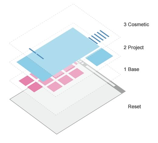
Style linking order
Every layer styles must be linked to the page in right order to maintain right relations between selectors of different modules/layers:
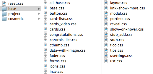
0_layer_foundation
	reset.css

1_layer_base
	base_modules.css

2_layer_project
	project_modules.css

cosmetic.css
1 layer — base
First layer - is a website framework, the core part of interface. It is based on most reusable and abstract constructions:
- forms
- buttons
- navigation blocks
- and etc
Base layer styles must be integrated with designers style guides as close as possible. As modules of first layer are meant to be reused across all website interfaces, they must look appropriate and fit to other interface parts without modification.
Starting to use MCSS in your project, the first thing you should do - is creating a set of reusable standards.
You can easily reuse popular frameworks such as Bootstrap, 960gs, inuit.css and others as part of the first layer.
Rules
First layer fundamental rule - all entities should be abstract, both with their names and mark-up.
- Class names should not look “foreign” in any place on the interface.
- Module blocks should have default style, but also should be easy to modify according to various project modules and tasks.
First layer styles could be cascade-modified from other modules of the same layer and 2nd layer. This is due to the Rule regarding location of related styles in one place.
Base styles should be separated from 2nd layer modules and stay independent from project layer styles.
Forms standard:
.input-field { }
    .input-field_text { }
Form standard interaction with button standard - cascade modification from 1st layer:
.input-field { }
    .input-field .button { }
Project module interaction with the standard in the 2nd layer:
.project-module { }
    .project-module .input-field { }
2 layer modification from the 1st one is forbidden! In this case, layers are mixing up, causing chaos:
.input-field .project-module { }Base styles are connected right after the foundation, prior to 2nd layer, to support low level priority in selector weight.
Advantages
Reusable and well thought-of first layer modules allow saving time on support of popular constructions, eliminating the need to maintain several similar modules. Re-usability also as well affects the final size of CSS-files and page rendering time.
Having well-developed base allows to create new interfaces easily, most of which consist of standard elements.
The samples of standard designs can be reused from one project to another, allowing accelerating the development both of the layout and backend functionality connected with it.
2 layer — project
Second layer includes isolated, project modules, which further construct the page:
- Registration form
- Login block
- Shopping cart
- and etc
Rules
It is recommended to use as many as possible unique CSS classes in second layer layout; even if current design does not need styling, better practice is to assign unique CSS class to it. Such approach provides better availability of each separate layout block, which allows easily correct styles, without affecting HTML structure.
Each module has to be as isolated as possible - independent interface block, which interacts with the base layer only.
To use the first layer construction in project module, we need to assign one more CSS class into HTML:
<header class="toolbar">
    <a href="/" class="toolbar_logo"></a>
    <menu class="toolbar_dropdown_ul umenu">
        <li class="umenu_li"></li>
        <li class="umenu_li"></li>
    </menu>
</header>
Example displays second layer module .toolbar, which uses first layer standard .umenu. To modify standard for project needs, CSS cascade is used:
/* Toolbar
-------------------------------------------------- */
.toolbar { }

.toolbar_dropdown_ul { }
    .toolbar_dropdown_ul .umenu_li { }
/* /Toolbar */
Project layer styles may be cascade-modified only from other project layer modules!
This is right:
.project-module .other-project-module { }This is wrong:
.base-module .project-module { }Advantages
Module isolation provides easy access to their styles, without risk of affecting other interface parts. When working in team, each team member can develop single layer separately, not getting in to conflict with other developers.
Styles of each module may be applied only to those pages, where they are needed.
When functionality is disappearing from the website, it is easy to get rid of unnecessary styles - all that is required is to throw out one module with corresponding styles.
3 layer — cosmetic
Third layer consists of simple, slightly affecting styles:
- links colors
- low-level OOCSS - two properties for CSS class (.font-size_XL, .margin-t_L)
- global modifiers
Layer can be nonexistent in some cases of methodology usage, but in big projects, this layer allows to solve the duplicate styling issue and to describe rare, non-project conditions, going ‘DRY’.
Rules
Third layer styles should be organized in a way to keep layout safe when styles are being discarded. Losses should be minor e.g. colors, paddings, etc.
It is allowed to use some of simple OOCSS classes, two classes for block maximum, for rare, non-project situations:
<div class="font-size_XL margin-t_L color_red"></div>Cosmetic layer styles cannot be modified with cascade from other layers, except the context selectors.
Cosmetic styles are applied at the end of CSS. It is not recommended to use !important.
Advantages
Styles doesn’t have major effect to website layout, however helps dealing with duplicate code issue and eliminating the need to produce small project and base modules.
Simple selectors allow to quickly deal with rare situations, when we need to apply a couple of properties for non-project module.
Context
This layer includes styles of high context and @media-rules that can be used for changing standard styles for features of different context:
- .ie8, .ie9 - browsers
- .touch
- .logged-in
- media-queries
Context layer is an exception in style location rules. Styles of this layer are being distributed between all layers, which are being cascade-modified from context:
/* Module name
-------------------------------------------------- */
.module { }

.module_list { }
    .touch .module_list { }
    .ie9 .module_list { }

@media screen and (max-width: 1000px) {
    .module { }
    }
/* /Module name */
Real life examples
You can check MCSS in action in this demo. In the following example, all layers are stored in one CSS file, but they could be also separated to individual files (blocks):
In second demo, you can see how MCSS works with Bootstrap, as first (base) layer.
Site of the project is also designed by MCSS methodology; do not hesitate to look at the source.
Here you can find more complex example of MCSS methodology usage with video recording of development process.
Abbreviation dictionary
To escape large CSS selector names, we suggest using abbreviation dictionary:
a - link (<a> tag)
ac - action
add - additional
aft - after
aux - auxillary

b - body | bottom
bg - background
brd - border
btn - button

cat - catalog | category
cl - clear
cnt - content | container
cnts - contents
col - column

dec - decorate
def - default
del - delete
descr - description
dm - delim
dyn - dynamic

e - error
el - element
ext - external

f - footer
fr - friend
ft - font

gen - general

h - header
hl - highlight
hv - hover
hld - holder

i - item
ic - icon
img - image
ir - input radio
is - input submit
it - input text
itx - textarea


l - left | label
lbl - label
lk - link
lr - layer
lst - list

mod - module | modifier

n - name
ntf - notification
num - number

opt - options
ovr - overlay

ph - placeholder
pht - photo
priv - privacy

r - right
rfr - refresh

scr - screen | scroll
sel - select
sett - settings
sm - small
spr - sprite

t - title | t
tx - text

w - wrapper
In future, dictionary will mo moved to separate documentation module.
Recommendations
Code style
Along with methodology, we advise to use following useful practices to improve quality of your code:
- Principles of writing consistent, idiomatic CSS
- Google HTML/CSS style guide - style guide for HTML and CSS code configuration
- CSScomb - tool for CSS-property sorting
Best practices
- Do comment CSS as much as you can, all non-standard constructions, magical numbers — this will be useful not only to the members of your team, but for you as we’ll, when you will be back to reviewing the code after couple of months.